Introduction
Beige, gray, and safe neutrals have dominated home decor for years—but 2025 is all about embracing fearless color! Color-drenched spaces are expressive, energetic, and full of personality. Whether you love deep blues, earthy terracotta, lively greens, or sunshine yellows, bold hues bring rooms to life.
This blog explores the psychology of color, top tone trends, and real-life techniques for creating vivid, balanced interiors. You’ll learn how to confidently select, coordinate, and layer colors—plus how TradeFurnish’s vibrant curtains, rugs, and cushion covers can help you master the look.
The Psychology of Color
Color influences emotion, mood, and perception in powerful ways:
Blues and greens evoke calmness and serenity.
Terracotta and earthy tones feel grounding and cozy.
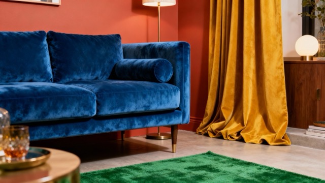
Mustard yellow and bold oranges bring energy and optimism.
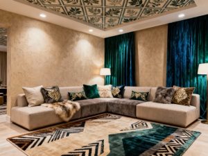
Rich jewel tones (emerald, sapphire, plum) suggest luxury and depth.
Bold colors express your style and set the tone for the entire home.
2025 Color Trends
Designers predict a surge in these impactful shades:
Terracotta – Warm, welcoming, and modern.
Deep blues – Elegant and soothing.
Moss and forest greens – Connection to nature.
Mustard yellow – Retro revival with a cheerful twist.
Earthy browns – Rich, timeless grounding palettes.
Dusty pinks – Soft yet contemporary.
Getting Started: Choose Your Signature Shade
Begin with a color you genuinely love—one that makes you feel good. Consider how you want each space to function and feel. For living rooms, green might foster relaxation; for dining rooms, terracotta or blue feels vibrant and fresh.
Balancing Bold with Neutrals
To avoid overwhelming spaces:
Pair dark walls with neutral floors or ceilings.
Use bold colors in one or two statement pieces (curtains, rugs, accent furniture).
Layer cushions in both daring and muted shades for balance.
White, cream, or tan provide breathing room for saturated tones.
Color Blocking and Layering Techniques
Color blocking uses large areas of distinct colors in one space. Try an accent wall behind a sofa, or contrasting rug-and-curtain combinations. For layering, combine a bold curtain or rug with subtly colored cushions, throws, and small decor.
Product Inspiration from TradeFurnish
Velvet Embellished Cushion Covers — Available in jewel blue, ruby red, and gold.
Blackout Velvet Curtains — Deep navy and burgundy options for mood and drama.
Jute Rugs — Natural warmth that complements bold tones.
Room-by-Room Color Play
Seasonal Color Transitions
Switch out textiles for a color refresh: reds and deep golds in winter, forest greens and blues for summer.
Troubleshooting Bold Color Mistakes
Too many strong colors? Choose one hero shade and complement with muted tones.
Not sure where to start? Begin with one statement piece, then add more color as confidence grows.
Overwhelm? Break up saturated spaces with white trim and wood tones.
Conclusion
Bold, color-drenched rooms reflect the vibrant spirit of 2025. With smart layering and careful balancing, you can create interiors that are lively without chaos, chic without caution. Explore TradeFurnish’s collections for every palette—and start living in color!
